To be honest, I never liked widgets and tried to remove them from the desktop of all my smartphones. I didn't even spare the Google Search widget, which went under the knife right after the clock and calendar – out of sight. The reason why I got rid of them was quite simple – I literally saw how these elements slow down the movement around the desktop, and my devices – by the way, regardless of the brand, they were strained to process them just to switch from one screen to another. Another thing is that widgets have always been the main advantage Android over iOS, and I wanted this to be true. But, unfortunately, in the end everything turned out differently.

Apple showed Google how to make widgets. But she herself can, it's a pity not for herself
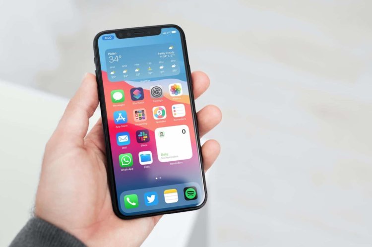
I think you already know that in iOS 14, widgets appeared for the first time in the history of the operating system. This was a rather strange step, considering that most of Android smartphones have disappeared. The reason is redundant functionality and the heavy load they place on the operating system. After all, even if you place 2-3 widgets on one desktop screen, it will almost certainly slow down and when you scroll down it will open with a noticeable lag. As the performance of modern smartphones increased, the lag became less and less noticeable, but Google developers did not manage to eradicate it completely.
Why widgets for iOS are better

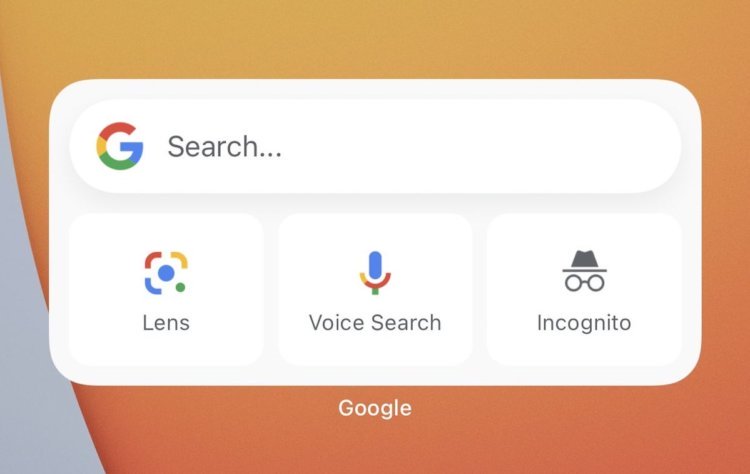
This is what the Google widget looks like for iOS

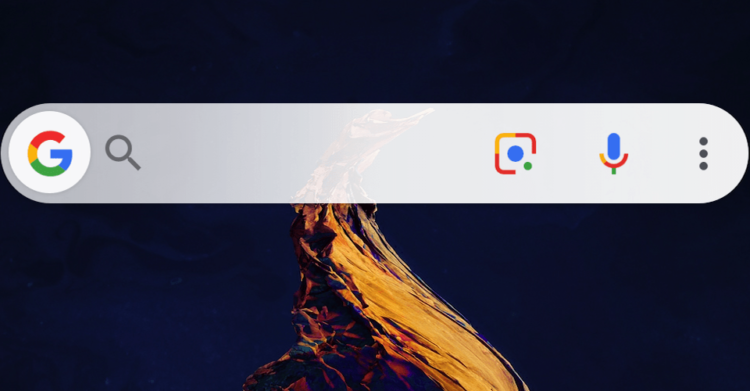
And this is the same widget, but executed for Android
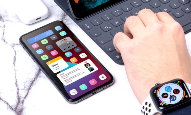
But Apple succeeded, and this was to be expected. The fact is that the developers of iOS – applications create their software according to uniform and well-defined standards. They are even executed all in a single style, without overloading the screen either visually or hardware, which is constantly happening on Android. Therefore, it is logical that even third-party programs' widgets work on iPhone as standard ones. Apple just took care of working out guidelines in advance, which now do not allow widgets to consume more resources than icons of ordinary applications, while their functionality and practical usefulness is incomparably wider.
But the problem Android stems not only from the lack of guidelines, but also from the obvious reluctance of Google to make a normal implementation even for the widgets of its applications. Compare what the 'Google Search' widgets look like for iOS and Android above. One gets the impression that for their OS the developers of the search giant made a widget according to the principle “if only it was”, and for a competing one they decided to try. In principle, this can be explained, because for strangers you always try to do a little better than for yourself, so that they don't think anything bad about you.
Widget problem on Android

On Android you can also make normal widgets, but only through a stump deck
Here are just Android widgets have been around for 10 years, and during this time, perhaps involuntarily, it was possible to make them something digestible. But Google failed, the manufacturers didn't need it, and widgets disappeared from the firmware of most smartphones as a class. Despite the fact that you can still enable them if you want, they are hidden by default, and the manufacturers themselves do not focus users' attention on them, obviously, making it clear that it is not necessary to activate them. After all, neither Huawei, Samsung, or anyone else wants their smartphones to slow down.
Why isn't Google redesigning the widgets to finally be normal? I have no idea. Despite the fact that from year to year in Android new functions are obtained and old ones are improved, for some reason, no attention is paid to widgets. I think that if Google had given widgets at least half of the time it gave them Apple, they would have played with completely new colors, and Android turned into an example to follow for iOS. But, apparently, it is more important for Google to do something earlier Apple, but how it will be implemented is no longer important.
