With the official release Android 9 Pie, the entire Android community began to study the new system. The notification bar, settings, status bar with support for notch (notch) and many other changes have been updated.
We decided to talk about the most interesting things we could find.
New Material Design 2
The upcoming release date Android P has generated more rumors and heated discussions about the design system changes. In February 2018, Bloomberg published an article about the “sad redesign” of the operating system, and as more information began to appear about Android 9.0, this article began to become believable. The notification panel has undergone big changes, with all the corners rounded a lot, along with a lot of home screen changes. The application icons have also changed, now they are also round, to match the new design.
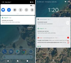
Rounded corners throughout as shown in the screenshot with notification bar and lock screen notifications
With the recent release of Android Pie, let's take a look at a new system that is completely different from its predecessor.
The first thing you notice when you see a new OS is the abundance of round and white. Instead of bright colors, solid white space, rounded pop-up corners and circular app icons, which is not at all like the past Material Design.
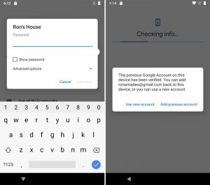
Pop-ups got rounded corners too
The most pertinent example is the redesigned notification bar, as well as pop-ups with a volume slider and smartphone shutdown / restart buttons, dialog boxes and a search bar in the settings menu. All changes fit perfectly into the new platform design.
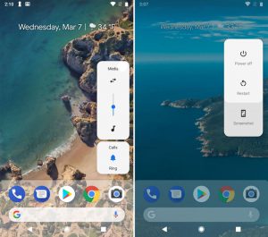
Rounded corners of panels with volume control and power buttons
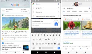
In the Google search box, type some text, and the search engine will immediately give you search results. Again, all panels are white with rounded corners.
One of the new branded apps – Google Pay (formerly Android Pay) repeats this style.
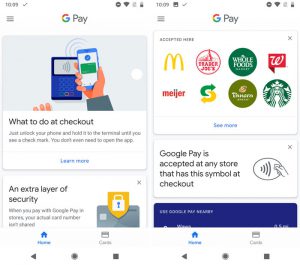
New Google Pay app, rounded corners window
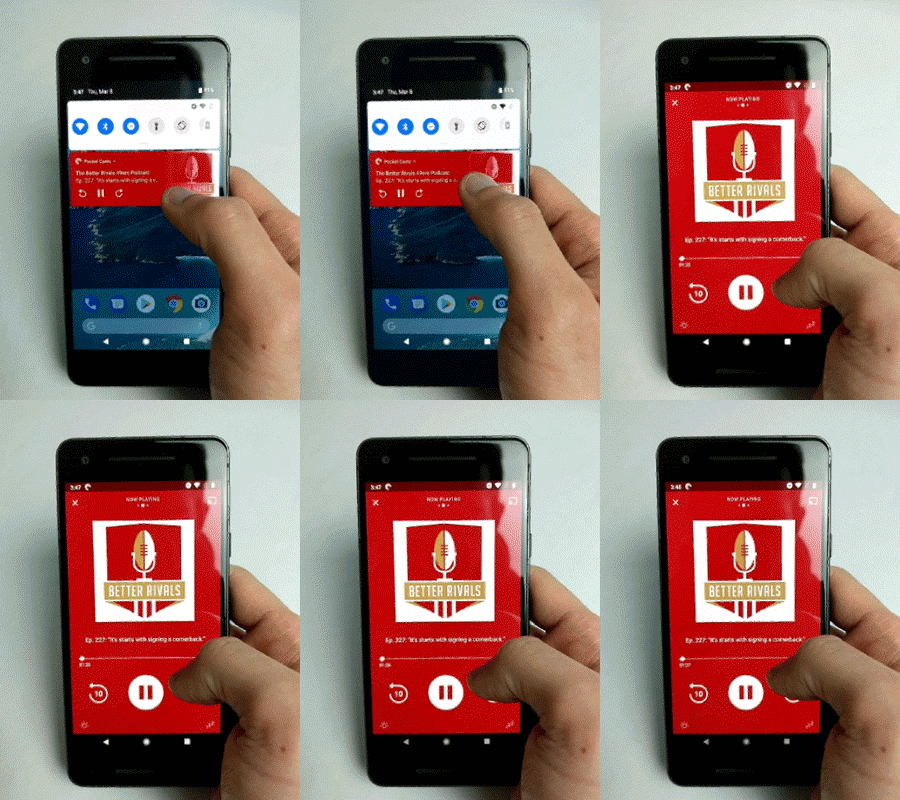
Full screen notifications
Android Pye uses the Google Sans font, which was used to create the Google and Alphabet logos. This font is now used for all buttons on the OS, as well as in notifications and dialog boxes. It is used in Google Pay, Google Assistant (since last year), in the settings menu when you first turn on the Pixel, and in the updates menu.
The new font is used only in Pixel devices and other products of the company, the rest of the devices use the Roboto font (by default), but if you wish, you can switch to Google Sans.
Can we say that Google has created a new design – “Material Design 2”? Yes. Before Google Chrome received a redesigned design for its first anniversary, we discovered that the developers of the Chrome browser had been working on a redesigned interface for some time, which was unofficially nicknamed “Material Design 2”. Soon this information was officially confirmed.
Many new animations have been added in Android P, especially for transitions between desktop screens and running applications. Now, when you launch the application from the notification bar, the received notification expands to full screen and then the application itself is launched. The animation of transitions between applications looks more interesting. When switching between applications or returning to the previous one, each new window displaces the previous one, expanding from left to right.
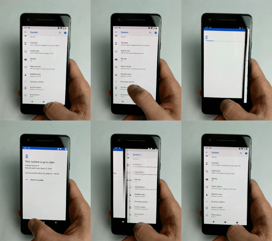
Horizontal transition between applications
When moving between sections of settings, these shifts occur in a vertical orientation. It looks like Google intends to switch to gesture control entirely, as it did in Apple. Note that such an animation would be great when going backwards.
You can manage new animations in the settings. Apparently, Google is working on some new system related to transition animation.
to the content
New notification bar


