Earlier, I published an article where I examined in detail what Google Play was and how it changed. In this article I will try to share, rather, my feelings from the store and how they have changed with updates. I've always praised Apple for offering its users a great app store, but it's worth noting that lately it has been doing pretty well to convince users of the quality of the app store Android and Google. It's worth starting with how the store of the American giant looked at its inception stage. And it looked, in truth, terrible – then it was called the Play Market. Although at that time, of course, the best could not be expected. Google Play was irrelevant for a very long time against the background of the App Store, and everything changed only at the end of 2019, when the company decided to radically change the structure of the entire store.
What was Google Play and how good is it today?
I still remember how in 2019, or rather at the beginning of last year, I wrote a lot of publications on the topic of how unpleasant it is to use Google Play. And the surprising thing is that to most he seemed normal, when in reality it was not. Against the background of the already updated App Store, Google Play, for me at least, looked just ridiculous. He had problems with the quality of the icons, they were blurry. And it was noticeable with the naked eye on a smartphone with a FullHD display.
Google Play until the latest update
In addition, the structure of Google Play itself at that time was fundamentally displeasing to me due to the fact that applications and games were located together on the main screen. This prevented only applications from being searched. Google Play tried to slip games on me even though I don't play. At that time, the App Store had already been updated (2017) and began to offer its users a division into tabs with games and applications, and such a division certainly seemed logical and understandable. In addition, the App Store offered a home screen on which various articles were located, and until now, by the way, they are published, and this is one of the points that I am not satisfied with on Google Play now, and I also wrote about this recently.
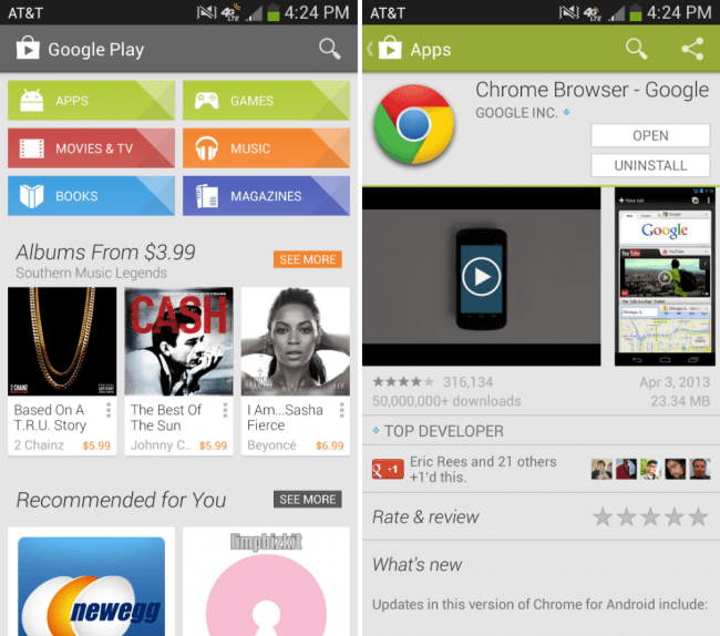
This was the store in 2014:
Google Play app store in 2014
And this is how Google Play looked even earlier – in 2012:
Google Play in 2012
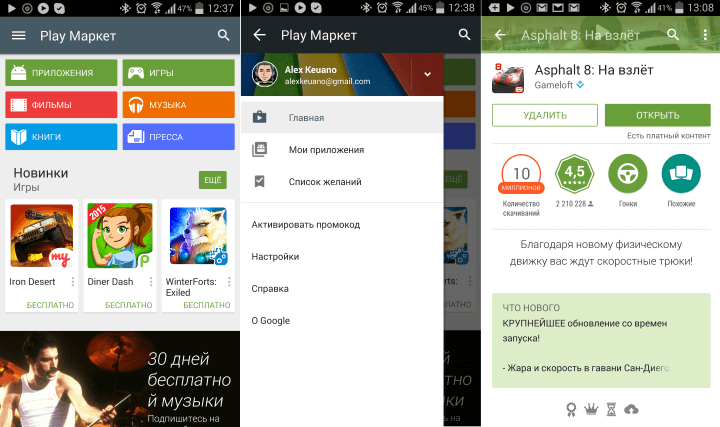
Google Play received a major update on October 17, 2015, then the structure of the home screen changed noticeably, but you can see that even in those days, applications and games were in a common tab, which was not very convenient.
Google Play in 2015
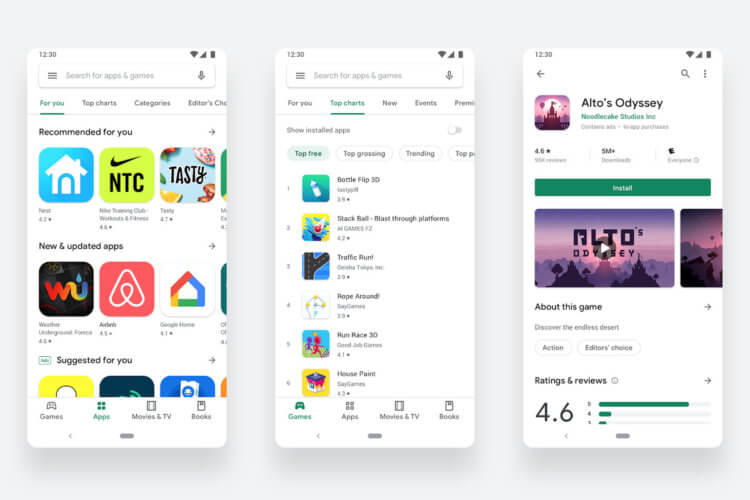
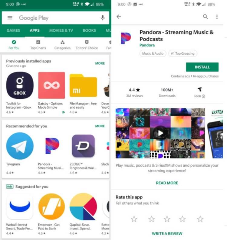
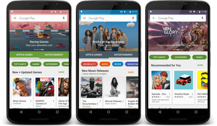
It would be nice if Google, similar to the App Store, published unique daily articles with a selection of the best apps. But, in my opinion, the most important thing that the company has done is the division into applications and games. Now I can easily view only applications, and at the same time I will not be disturbed by various games that are of little interest to me. The only thing that still seems a little inconvenient to me is that the main page includes more subsections in the form of additional tabs. An inexperienced user can get confused by so many different tabs and sections, in addition, the main screen of each section has very long subcategories, and you have to scroll down for a very long time until you reach the end of the page.
Obviously, nothing is done just like that, and for sure in Google in some way, using A / B testing, they determine what the interface should be, but such a long list, at least, is not very pleasant to me. I would like to see something different. For example, the main page, the content of which is adapted based on neural networks. I do not need applications related to children and various entertainment. Google Play offers them, that is, the company displays subcategories on the home page, which, in principle, I am not particularly interested in. And it would be nice if in the future, based on neural networks, Google would only offer those subcategories that are really interesting to me.
Not so long ago, the company began to provide users of the app store with a subscription mode, when the user pays a certain amount every month and at the same time gets access to various interesting games and applications. Of course, this approach seems pretty good, but for some reason this function has not reached me yet, and I don't know how soon it will happen. In the updated Google Play, I really like the fact that the application icons themselves have become much larger in size, this makes the interface more spacious and comfortable to use. Earlier versions, for example, had much smaller icons, and you probably all remember those days.
And, of course, today it is a completely different store – much better and more pleasant, although you can see that the feed with subcategories has not changed much – we are also offered a number of applications in each of the subcategories and a button that allows you to go to the full list of subcategories. It would be nice if Google came up with something more interesting than typical subcategories.
It's interesting to know how you feel about the current Google Play design. In my opinion, it looks pretty good, and I can safely use it on a par with the App Store, at least now it does not seem to me as bad as it used to be. Share your opinion in the comments and don't forget to subscribe to us on Telegram.