Miyuay is not an insult at all. The company Xiaomi came up with an interesting name for their shell. The acronym can be decoded as MI User Interface, pronounced 'Me You I', which is also pretty funny. The first version of the system was based on Android 2.2 and was presented back in 2010. We can say that this year is a jubilee for the shell.
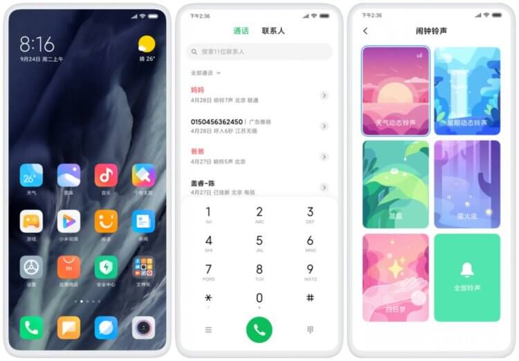
MIUI 11
This is how MIUI v1 looked like:
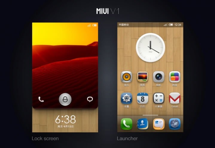
MIUI first version
And this is how it looks now:
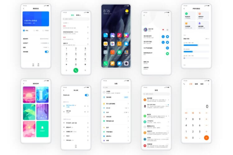
MIUI 11
The system is neat and clean. Xiaomi has added many useful features over the past 10 years. MIUI offers fast and frequent updates, the company updates even not very powerful devices, and special thanks to them for that. However, for 10 years the company has not learned to offer not just functional software, but high-quality. Now I will try to explain what does not suit me.
Not very smooth operation
Device owners Xiaomi need to understand what this is about. Due to the fact that the company produces a lot of devices, while updating them quite often, the company constantly has problems with bugs and lags. MIUI even on new smartphones it manages to slow down, animations may not work very smoothly. The owners of the new Redmi K30 complained about this, who bought a phone with a 120Hz screen and a laggy shell. Immediately after the release, the company released an update that fixes performance problems, but it seems that for Xiaomi the release of new smartphones is like a conveyor, where it is important to be in time as quickly as possible, spending on development as few resources as possible.
Not so long ago I updated my Redmi 6 to MIUI 11. Although the smartphone did not receive a new version Android, the shell was updated. Before the update, the device worked smartly and smoothly, after that everything began to slow down wildly, the smartphone began to think, and almost all animations are jerky. It is not clear how Xiaomi tests their updates, but this is clearly not what I expect from Android – the manufacturer. Previously, we scolded Apple for the fact that with each update it slows down its phones, now everything is completely different.
For 10 years Xiaomi it was not possible to bring MIUI to the point where I could confidently declare that this is the best shell based on Android. Another point that I don't really like is the ad banners built into the system. However, it is worth considering the low cost of the company's devices, thus it tries to make a little money on its products, and the guys should not be blamed for this. However, the presence of advertising cannot be compared with the optimization of software. We can get used to advertising, but no one can get used to the brakes and bugs in the system.
Design and animation
For 10 years Xiaomi, it has not been possible to create a shell with a beautiful design and pleasant and smooth animations. Launching each application, interacting with something leads to some not very smooth and strange animations. Everything inside MIUI is kind of twitchy, I can't describe it in another way. Even Samsung's OneUI seems to be more interesting both externally and in terms of animations. All interactions in OneUI are smoother and more pleasing to the eye.
I hope that Xiaomi will start to pay more attention to software. New functions are always good, but it’s better to do it well than to release raw software, and then finish it with updates. Let's take a look at OnePlus. The company offers its own add-on over Android, and yet they manage to offer a smooth and fast interface with nice animations. Below is a small comparison with the OnePlus shell.
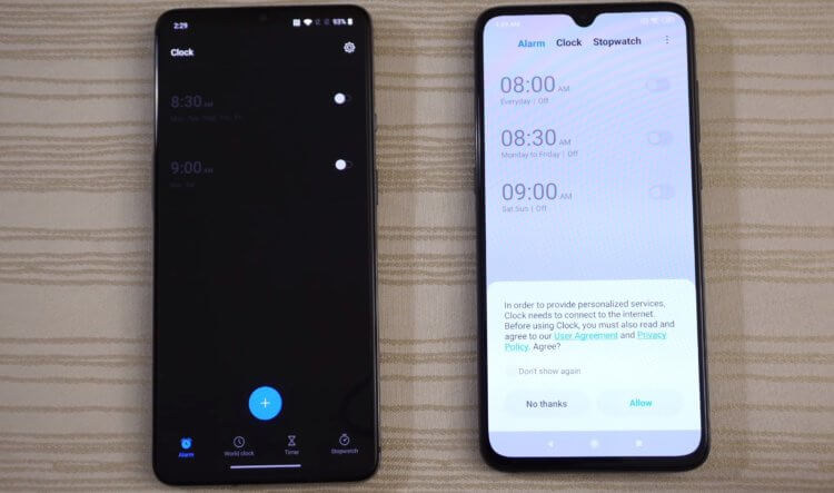
OnePlus 7T vs Xiaomi Mi 9
What unpleasant moments are there? Have you noticed? The problem is in this modal window. The navbar is gray, although it's much more logical to leave it white so that it blends harmoniously with the window – it's so obvious. In the modal window, the confirmation checkbox circle is hard to distinguish, it does not comply with the principles of accessibility: people with poor eyesight should easily distinguish important interface objects. Here, the checkbox is not visible at all. Besides, the indent on the right is too small, and the text 'Don't show it again' sticks to the checkbox. Why is the company so indifferent to the quality of the interface?
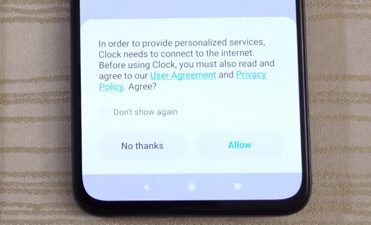
MIUI 11
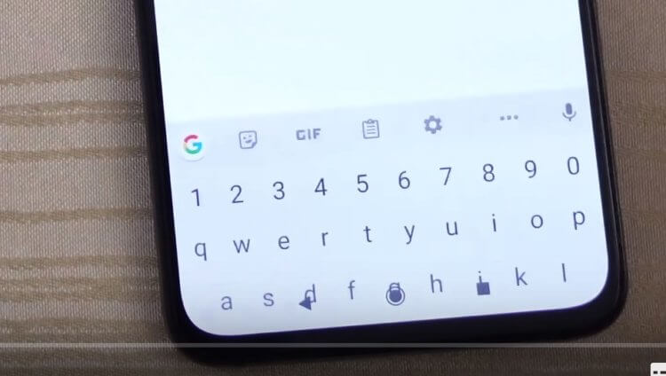
Now let's see how the keyboard behaves. In a video comparison from Tech Timmers, the guys in the Google Play app clicked on a suggestion in the search menu, and the keyboard disappeared at that moment. Let's see how the process of hiding the keyboard works:
MIUI 11
The navbar is layered onto the keyboard, with the left and right buttons in the navbar moving up a few pixels after the hide animation finishes for no apparent reason. In these nuances, the approach to software development is manifested, in Xiaomi it is bad, in my opinion.
What do our readers think? How do you MIUI? Share your opinion in the comments and subscribe to our news in Telegram.
