 The second beta Android Q is finally out. Despite the large number of bugs that Google has repeatedly warned about, we decided to take a look at the new build of the future operating system Android 10 Q. In the second beta, a completely new feature was added – Bubbles , as well as many other minor changes.
Keep in mind that this is just the second beta, so don't be surprised by the large number of bugs in the system.
Bubbles: a new extension for messages or a replacement for the notification bar?
According to Google, Bubbles is a new multitasking option that is similar to the Chat Heads feature in Facebook. The new function works as follows: when you receive a message in the Messages application, a small icon with the sender's photo appears on the screen. When you click on this button, a small chat window opens.
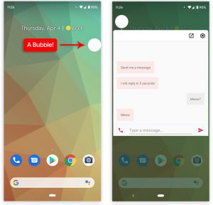
Click on the button in the shape of a bubble, and a correspondence with a specific contact will open in front of you.
The Bubbles feature will be supported at the system level, allowing third party software developers to integrate Bubbles into their applications.
To add support for this feature to your application, you first need to update the application itself to meet the new requirements. At the moment, Bubbles is only implemented in the Messages app.
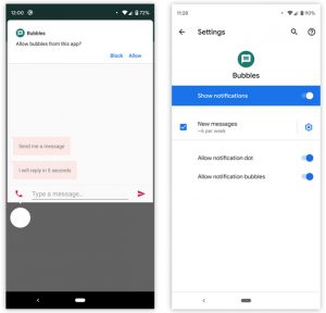
Bubbles can be turned off.
You can also create such icons manually by clicking on the button in the upper right corner of the screen. Same as with Chat Heads in Facebook. The created shortcut can be dragged to any part of the screen. To remove the icon, drag it down the screen.
So far, this is just a demo version, so it can only be tested on predefined bots. The bot will reply to your message within 5 seconds. When you first create an icon with one of your contacts, the system will ask you for permission to pin the icon to the screen. You can, of course, opt out if you don't need extra elements on the screen. The function can also be configured in the corresponding settings.
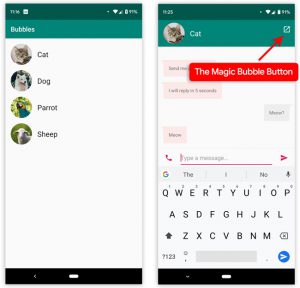
In the Bubbles demonstration, you can talk to animals.
The new feature is still somewhat buggy. For example, by default, all icons appear at the bottom of the screen. But if you decide to open the keyboard, then it will simply close all the icons instead of moving them to a free part of the screen. At the moment, this problem is solved only by entering a special ADB command, which transfers all icons to the top of the screen. Another bug is the display of contact avatars, which are simply not available in this beta. In this regard, Google has reported that all icon images are intentionally disabled in the Developer Preview Beta 2.
And the last bug that we managed to find in this function is that when the chat window is open, after clicking on the Bubble, the notification panel stops working. Therefore, you have to close the chat window to use the notification panel.
to the content
Bubbles setup via ADB commands
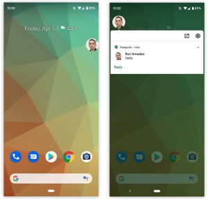
You can use Bubbles in other applications, but only with ADB commands.
We found some interesting ADB commands that can be used to change how Bubbles work. For example, by default on the second beta, only one application supports this feature: Messages, but you can make Bubbles work in all other messengers. If you want more, you can make all incoming notifications appear in the form of these icons.
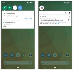
Bubbles look unusual, but cool.
To add Bubbles support to other apps, you need to:
- Connect your phone to your computer;
- Enable USB debugging on your phone;
- Enter the command you want, for example adb shell settings put secure experiment_autobubble_messaging 1.
But this has one big drawback, when you click on the next bubble that notifies you of a new message, you will be presented with a standard notification window. This is because the application developers themselves have to deal with the integration of Bubbles into applications.
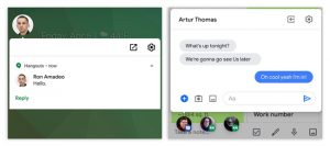
On the left – Bubbles integrated using ADB commands; on the right – Bubbles, integrated by the Messaging developers themselves.
As you can see in the screenshot above, it's best to wait until app developers start adding this feature to their apps. According to Google, they created a very easy-to-use API for developers, so there will be no problem adding Bubbles support to applications. Who knows, maybe Bubbles will replace the standard notification bar in the future.
to the content
Bubbles: new feature or well forgotten old one?
This function was partially used before, but not on such a scale, so few people knew about it, and few people paid attention to it at all. For example, the standard Phone application uses this function during a call. If you return to the home screen during a call, the phone call interface will collapse into a small circle. By clicking on this circle, several options for conversation will appear in front of you.
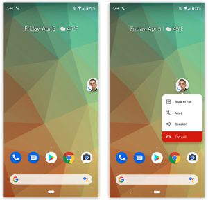
These are not Bubbles, but just a custom modification of the default Phone app that repeats the same idea.
Anyway, the Bubbles feature can be called a continuation of the idea of the “Picture-in-Picture” mode for YouTube, which was introduced in Android 8.0 Oreo. Let's hope that this is the case and that the “Picture-in-Picture” mode will also be updated.
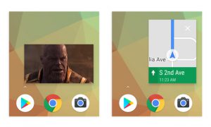
Examples of Google pop-ups: Picture-in-Picture on YouTube and Google Maps mini-map.
Google noted that the new interface will be useful for drawing up notes, reminders, translating text, but it is not yet known how all of the above will be implemented in practice. But one thing is for sure, the new function will be very popular, since already now you can find many applications, launchers and firmware on the network in which this function is implemented to one degree or another.
to the content
The idea is not new, but it works well
This feature was first introduced in Facebook under the name “Chat Head”. And although she is already many years old, she copes with her task perfectly. The created shortcut can be moved around the screen as you like, so you won't lose sight of it wherever you climb.
The idea itself is very cool, and it can be developed in different directions. Just imagine that it will be possible to select a specific group of applications and contacts, notifications from which will come in the form of a pop-up bubble on the screen, so that we will immediately understand what it is and from whom.
to the content
Notifications
In Android Q beta 2, it is now possible to rewind music or videos directly from the notification bar. It is not clear why Google has been unable to implement this feature for so long, since most third-party applications already support it.
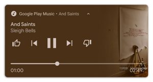
Multimedia notifications are slightly larger.
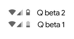
The battery icon design in the status bar has been updated to reflect the new Material Design 2. The Wi-Fi and network icons will likely be updated in the future as well, as these icons usually look the same.
In the Settings menu “Apps & Notifications”, there are a couple of new features. In Android Q Beta 1, Google changed how notifications were removed. If earlier you could remove a notification by swiping in any direction on it, then in the first beta it became possible to delete a notification only by swiping to the left. Many did not like this, and as a result of a large number of negative reviews in the second beta, it became possible to choose: swipe in which direction will delete notifications.
Why not leave it as it is? The reason is that when you swipe in the opposite direction, two buttons will open for you:
- to block receiving notifications from this source;
- for repeated notification reminder.
This has existed before, but you had to very slowly move the notification shade to one side to open these buttons. Therefore, you may have accidentally deleted the notification.
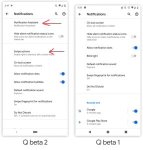
Added two new settings in notification settings. Swipe Actions and Notification Assisstant.
These two buttons were rarely used. Especially in light of the fact that it was possible to block the receipt of a notification from the settings, if there was a need for it. Removing notifications by swiping to either side was a much more necessary thing, since people hold the phone in different hands, and you have to delete notifications very often.
Notification Assistant – Notification Assistant
Google has been trying to improve the area of user interaction with notifications year after year. In Android Q Beta 2 in the settings menu: “Applications and notifications” – “Notifications”, there is a new function – “Notification Assistant”.
There is no official information about the capabilities of the new assistant yet, and the only information you can get is a pop-up message that pops up when you enable this setting item. An approximate translation of this message is as follows:
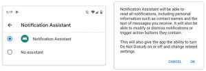
“The Notification Assistant will be able to read all of your notifications, including your personal information such as contact names as well as text messages received. He will also be able to change, delete notifications, or use the action buttons that are associated with them.
The assistant will be able to turn on or off the Do Not Disturb mode at will and change the appropriate settings. ”
Despite the small amount of information about the new assistant, some details are already known, which we managed to learn from the published document by Google. This document says that Notification Assistant will be able to modify notifications by adding new features to them, for example, when you view a notification, you may have a button to call that person or a button to reply to a message.
to the content
Gesture Control: What's New?
Gesture control was one of the major updates Android 9 Pie and the biggest change in the operating system navigation area since Android 4. From now on, instead of the standard “Back”, “Home” buttons, “Running applications”, there are only two left. One of which appears only when the application is running. Now, to open the menu of already running applications, you need to swipe up on the icon or swipe to the right to quickly switch between running applications.
This was undoubtedly a huge step forward for Android, but the solution was still very crude, in some places even strange and meaningless. Therefore, the new gesture control required some revision.
In Android Q, gesture control has been slightly changed. Now, when you swipe to the right on the icon, you will go to the previous application, and when you swipe to the left, you will go back one step, by analogy with the “Back” button. Switching between running applications occurs without going to a separate menu, as it was before. Now it will feel more like flipping through screenshots: very fast and smooth. While you are frantically swiping left and right, a Google search bar will appear in front of you, which looks very, very strange, and it is not clear what it is for at all.
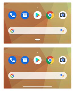
Updated tablet design.
Apparently, Google is just trying to reduce the space occupied by their icon, since at the moment it takes up the same space as the 3 old buttons before it. We found a hidden setting, when activated, which replaces the old icon with another, very similar to the icon in iPhone X, which supports this theory.
Google still has a lot of work to do before polishing its gesture navigation, but let's hope that the situation will change for the better by release, if not – let them give the opportunity to return to the good old 3 buttons.
to the content
Other changes
A new button has appeared in the pop-up volume control window, when pressed, a large panel opens with volume control for various elements: multimedia, bell, alarm, etc.
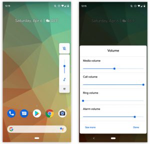
Added a new ability to adjust the volume separately for multimedia, calls, signal and alarm volume.
Screenshots no longer fit to the cutout screen.
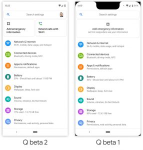
Removed rounding of corners and monobrow in screenshots.
In the first beta, we were shown new accent colors and fonts that could be chosen to your liking. It became known that in the second beta a separate application was released with branded Pixel themes, which absorb everything that became available in the first beta.
Now officially: in Android Q there will be native support for the mode of simultaneous operation of two SIM cards.
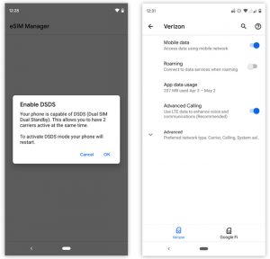
Support for simultaneous operation of two SIM-cards is included.
When you turn on the Wi-Fi module in the main settings menu, you will be shown a list of available connections right in this menu.
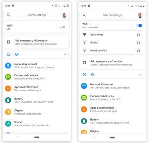
to the content
See you at Google I / O!
The third beta will be released in May. Most likely, right after the Google I / O conference, at which they should show us and tell us about the most delicious new products Android Q. The conference will be held on May 7. Do not forget to follow the news on our website in order not to miss the latest information from the Google I / O 2019 conference.

Beta release timeline Android Q.
