More and more often we hear questions about when a dark theme will appear in a particular application. Against the background of this article about her appearance, a large number of views are collected, which confirms the interest of people in this topic. At one time, there was even a meme about a dark topic that either made fun of the public's interest in it, or, on the contrary, confirmed that it was needed. The question is why TT, as it is called for short, has penetrated so deeply into the minds of users around the world, like a coronavirus, from which everyone has already managed to get a little tired. If you, too, wondered when something would get a topic, or would like to have less talk about it, we have something to discuss.
Many want it to be.
What is the secret of the popularity of the dark theme
I couldn't find an exact answer to this question. I really wanted to find the opinions of psychologists, marketers, designers, and anyone, even NLPshnikov, if they were wrong, but I did not see a clear opinion. I had to go to forums, comments and our Telegram chat and collect the opinions of ordinary people. In the end, this is where I got to in my search.
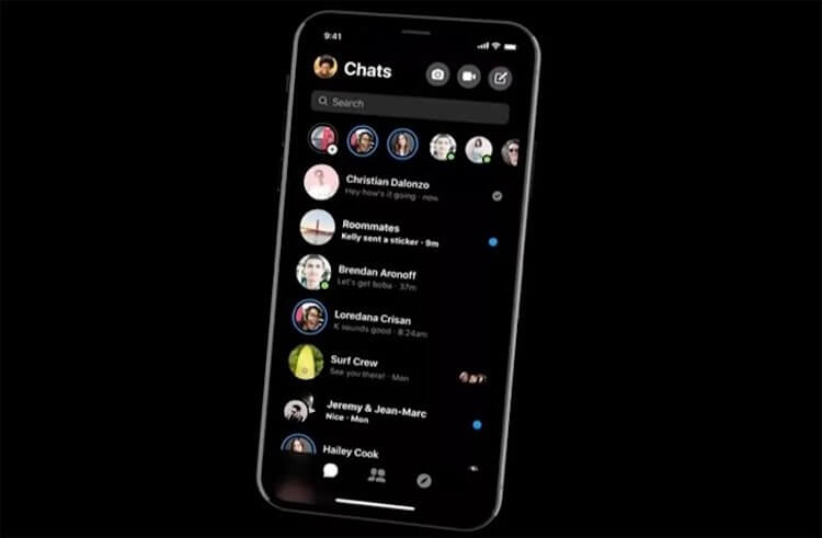
Dark theme on OLED display
First of all, everyone says that dark theme is good on OLED – screens of which there are more and more. Here I can only fully agree. It really looks impressive. Especially in complete darkness, when the letters on the screen literally float in the air. In other cases, the difference is not so noticeable. You just see better that you have a clear black color.
Would you customize your smartphone like this? Or is a white background better?
Dark theme saves your eyes
It is believed that a screen with a dark theme not only looks good, but also saves your eyes when used in the dark. Just because the white stream of light does not hit the eyes, as from a searchlight. This is a bit controversial, since many still claim that their eyes, even when using a dark theme, get tired of the screen in the dark. In addition, so far, no one has been able to properly refute the information that OLED – screens are, in principle, more harmful to the eyes than IPS because of the greater flicker.
So far, the lesser of evil for the eyes when using a smartphone in the dark is the choice of night mode with a muted blue spectrum on the IPS screen. Better yet, just don't use the screens in the dark. Even a TV and a computer severely spoil the eyes when they hit from the darkness with a bright oncoming stream. When it is light in the room, the eye itself adapts to bright light and does not strain so much. You can argue with this, but over time you really start to feel it. If someone says that he does not have this, you just have to wait a little – he will appear.
Dark theme looks stylish
In addition to the benefits described above, according to users, there is one more. It lies in the fact that the dark theme makes its owner stand out from the rest. Although the situation has changed a bit recently, many people still like the way a black picture looks on a smartphone screen. There is something modern and breakthrough about this. Many people think so.

Overall it really looks classy.
Dark theme is more informative
I also came across the opinion that a dark theme, if it is well drawn, is more informative. Supporters of this opinion argue that this is an evolutionary development of the interface, which allows you to read information faster and more correctly. Perhaps there is something in this, but I don’t really agree with the development. I had a dark theme on my HP iPaq 4700 PDA about fifteen years ago. Then no one said that this is the trend of the future. People just read books with a dark backing if they liked it. Not much has changed now, apart from trends and hobbies.
On the other hand, there is nothing wrong with designers trying and coming up with something that people like. Although, I'm more inclined to the fact that designers themselves suggest innovations, and not listen to the crowd, which often does not know what they want. As a result, it may turn out, as in the anecdote about the deaf-mute grandfather who caught a goldfish and now he has a guitar, chest and ski poles.

This can happen when designers and developers follow the lead of users.
When is the dark theme for all apps coming?
The problem with the spread of the dark theme is that it's not enough to just make the white background black and the black letters white. A lot of work needs to be done to fully adapt. It will take not only the work of a designer, but also a programmer. They will have to come up with and implement new designs and how the elements work. Everything should be visible and in some cases the application will literally have to be rewritten.
Many big products have already done this, but some semi-amateur apps will definitely adapt for a long time or simply release an interface that will make your eyes dazzle and hurt your head. I have personally met such examples. At the same time, if applications still somehow allow you to adapt, then some sites that support the dark theme are a real pain. Even my not particularly demanding designer inside knocks on the battery with a screwdriver and asks to turn off this ugliness.
A dark theme doesn't always look good.
There are examples of applications that work well with a dark theme, but somehow not fully adapted. For example, the YouTube and Yandex.Maps applications on iOS display a white splash screen when launched and only then open a dark interface. Such a flavor is generally incomprehensible to me.
What the interfaces of the future will be
It's no secret that everything is heading towards the widespread introduction of AR into our lives. In some ways it will be really convenient, for example, when using glasses for additional information, but somewhere it will be easier to use the old fashioned way. In any case, it is generally believed that interfaces will become transparent over time.
The problem is that even with a transparent interface, it will be necessary to make an underlay for the letters so that they are better read. So the question is what it will be. It seems to me that, most likely, it will be translucent, and its shade will be adaptive and will adapt to the surrounding objects. If there is no substrate, then in some cases reading information will be even more challenging.
Let's discuss in the comments how you feel about the dark theme. The opinion of each person is important. The more there are, the better. I'd like to know, at least in a couple of words, the opinions for and against the dark topic. In the meantime, take part in the survey below.