I know a lot of guys who still use old devices without trend chips. A lot of people still go with Xiaomi Redmi 5 Plus, which bombed so well in its time. But times are changing, and phones are changing along with them, offering the user various trendy things. In this article, I will talk about several features that have begun to strain me a lot lately. They negatively affect the usability of the phone.
Why I do not support the new trend in the world Android
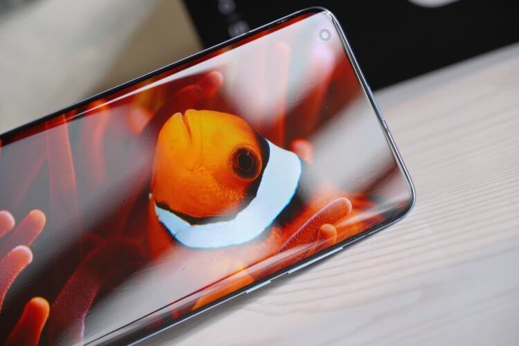
I recently ditched the old iPhone in favor of Xiaomi Mi 9 Lite. The device offers very thin bezels with smooth corners and a teardrop notch. Such a solution, of course, at first glance, seems convenient, trendy, but this is only at first glance. Over time, the rounding of the corners began to annoy me wildly.
I'm tired of these curves!
The fact is that with strong curves, the work space shrinks – they put pressure on you. It's clear that in this way the company makes the bezels thinner, but why not make the corners of the phone sharper so that the bezels at the corners are not so oval?
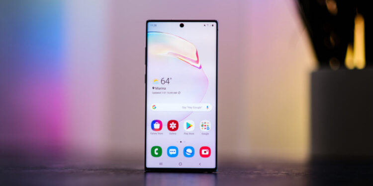
Galaxy Note 10 offers the best solution for rounding screen corners
In this regard, I like the way the Galaxy Note 10 looks. It only offers very slight curves. And at the same time, the case itself does not seem less comfortable from this. On the contrary, due to this, the usable area has increased.
Oh, those cutouts …
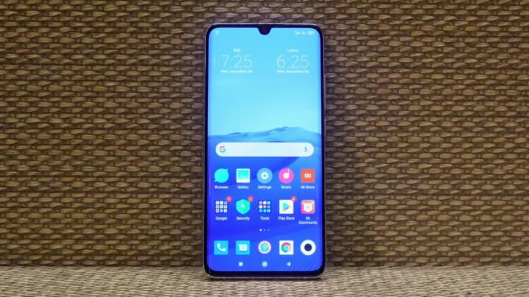
Xiaomi Mi Note 10 with teardrop notch
Cutouts are also a separate topic. Up until two years ago, a cutaway phone seemed revolutionary. Today they also annoy me. The 'droplet' is part of the status bar, but because of it the status bar itself is too broad. In addition, due to it, notification icons are not displayed in the status bar. You have to open the shutter with quick settings every time to see if you have missed anything.
Smartphones with a small bottom bezel
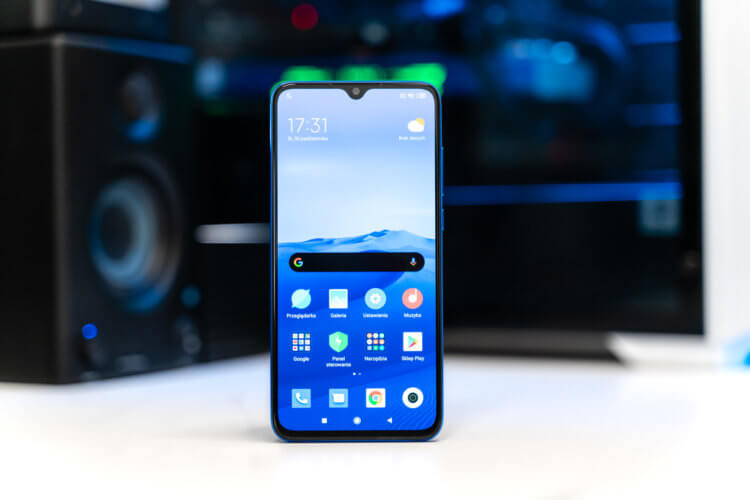
Small bottom border interferes with typing due to unadapted gBoard keyboard
Due to the too small bottom bezel, I had to make the gBoard keyboard as large as possible, but even in this state it is difficult for me to use it, since it is located too low. In iPhone Apple solved this problem with a blank area at the bottom of the screen, in the case of Android Google seems to be indifferent to the convenience of typing on a standard keyboard Android – gBoard.
Smartphones with waterfall screens
The same goes for waterfall screens that are rounded at the sides. The most striking example is Xiaomi Mi 10, which, by the way, was estimated at $ 900 in maximum modification. Of course, the effect is pleasant – it seems that the screen is floating above the surface. However, over time, you begin to doubt the convenience of such a solution. The useful content of applications can be located on the end of the phone, which is not very convenient. Google, of course, in Android 11 offered developers a means of solving this problem by reducing the width of the applications themselves, leaving black areas on the sides, but whether the developers will do this is a question.
Optimal flagship design in 2020
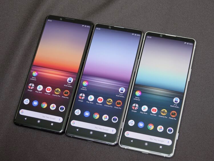
The Xperia 1 and Xperia 1 II are, in my opinion, perfect in terms of usability and real estate.
I missed the familiar screens. In 2020, I think Sony devices are the best option. It had previously unveiled the Xperia 1, and recently the Xperia 1 II. The phones have fairly thin bezels, slightly rounded corners and no cutouts. In addition, they offer an aspect ratio of 21: 9. This option, in terms of convenience and usable space, in my opinion, is optimal.
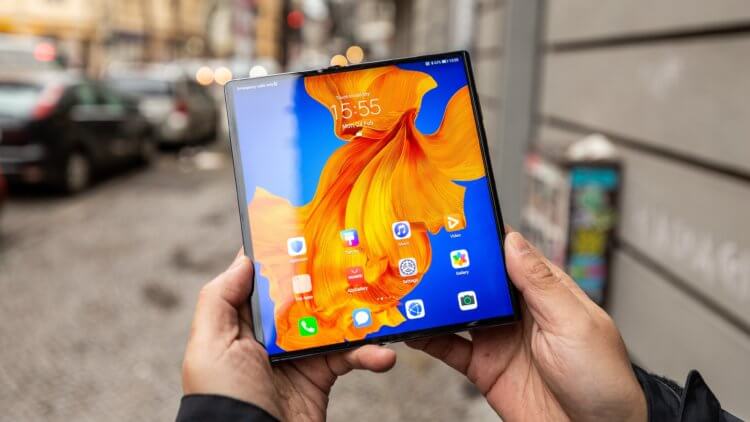
Huawei Mate XS
The same goes for foldable phones. The new Huawei Mate XS with reasonably sharp corners and no cutouts seems ideal for providing the user with maximum usable floor space. I cannot say that the Samsung Galaxy Fold seems more interesting in this matter, because its bezels are strongly rounded – useful area is lost – and the notch is quite large.
A budget smartphone in 2020 with a comfortable design

The best budget phone for usability?
If you try to abandon all the newfangled cuts and rounds, it seems that the ideal solution is a phone from Yandex, but it is no longer for sale. I remember scoffing at the device for the lack of cutouts and thin bezels, but using the Mi 9 Lite, I rethought my idea of design a little. The main convenience, and in this matter, the usual frames seem more comfortable. A large bezel on the bottom allows for convenient typing, and a bezel on the top with no cutouts makes it easy to watch YouTube videos. It seems to many that even a small 'drop' does not affect the quality of viewing video content, but this is not the case. Due to the notch in the Mi 9 Lite, I stopped zooming in on YouTube videos by watching them in 16: 9 format.
conclusions
I would not want to convince readers, my goal is to share a different view of the situation around fashion trends. A custom aspect ratio is great, but when the cutouts take up useful space, and it becomes inconvenient to type text due to too small a border at the bottom, questions arise.
If you have a different opinion, share it below in the comments and read us on Zen.
