I recently switched from iPhone to Xiaomi Mi 9 Lite. And, of course, after iOS it was quite difficult for me to get used to advertisements in the operating system, a large amount of unnecessary content, and also an insufficiently pleasant appearance. In iOS you have no questions about the interface – you just use it. In the case of MIUI, there are such questions, and this is most saddening. Fortunately Android allows you to somehow modify the interface, and that's what I decided to do.
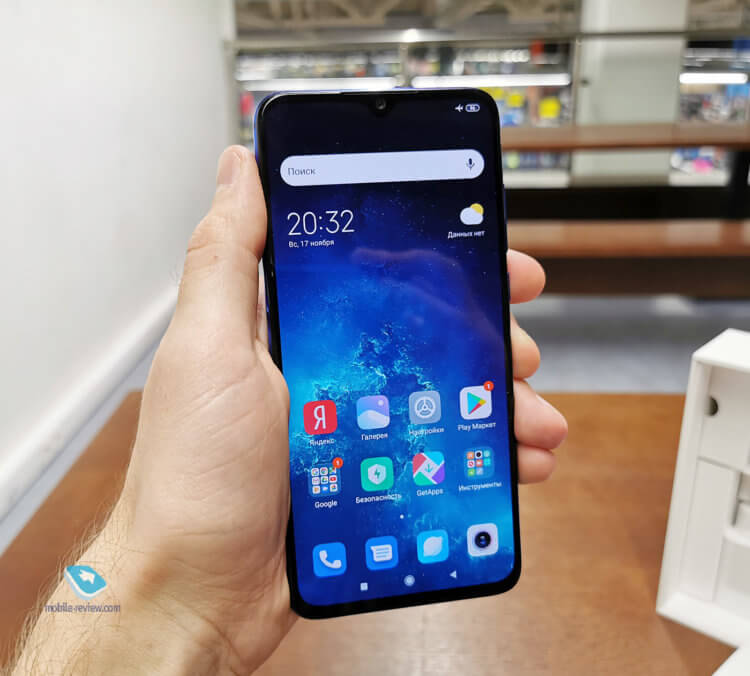
What my desktop looks like
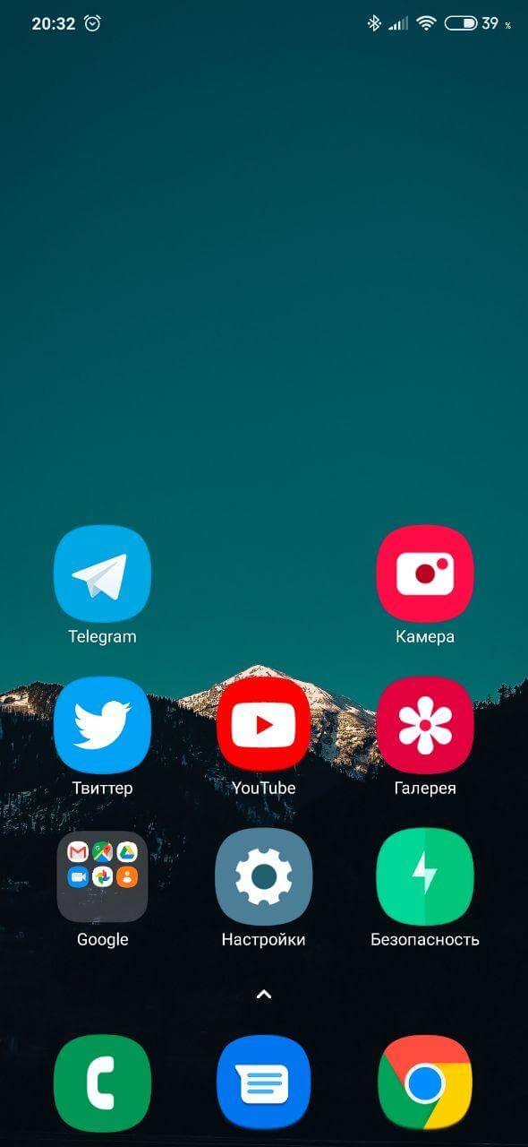
In MIUI, for example, I don't like that the animations are not very smooth and sharp. But nothing can be done about it. The only thing I could do was change the launcher and put custom icons. This is how the standard desktop looks like MIUI:
Standard desktop MIUI 11
And here is the desktop now on my device:
I decided to try the Poco launcher, and it seemed more convenient than the standard one, besides, here you can flexibly adjust the grid, including the size of the icons. I decided to try 3 apps in a row and max icon size. This combination, in my opinion, is convenient. You don't need to look too closely at the icons, the transition to applications is faster.
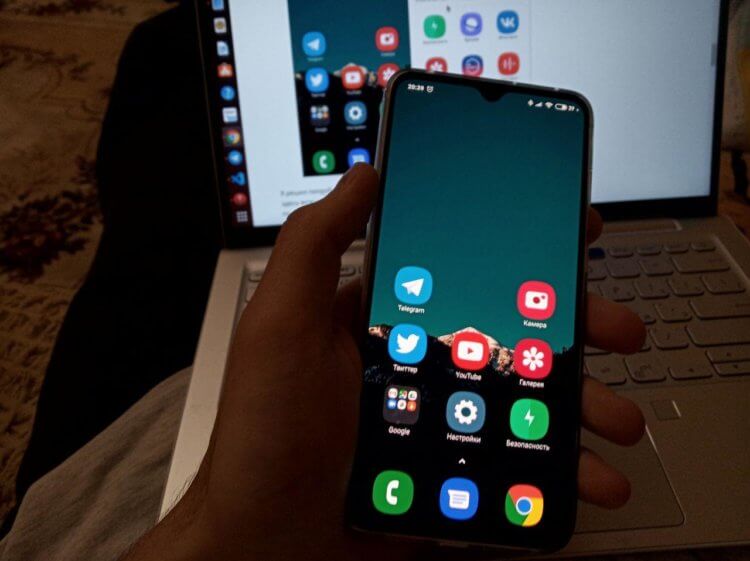
The size of the icons is quite large
In addition, as the screen grows, so do the interfaces themselves. If you compare the size of the elements in a modern smartphone and iPhone 6, the difference will be obvious. In the case of iPhone, I now have to squint to see the text, whereas in Mi 9 Lite this problem is no longer there.
Many will think that I am a lover of grandmothers and large interfaces, but no. When you see growing interest in foldable devices from manufacturers with screens larger than 8 inches, you start treating your 6-inch gadget as a compact device. And that's why now it is already difficult for me to work even with a 4-column grid. Such a large icon makes it easier to click on it. My thumb fits completely into it, and when using the device, the main interaction occurs with the thumb, therefore, in my opinion, this mesh is the best option.
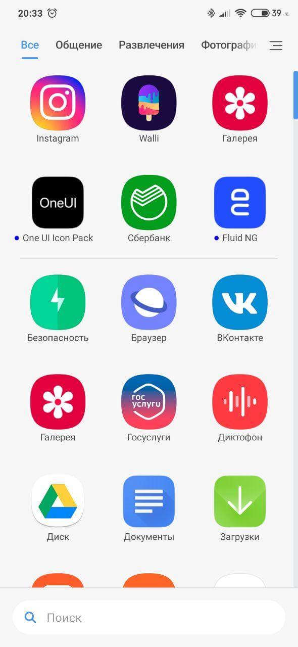
In addition, in the Poco launcher, all applications are hidden in the application menu, which opens with a swipe up. I also like this option more than the usual desktops, since now I have only one main desktop, where all the main applications are located, and if in the process I need some rarely used one, I can easily access it through the menu of all applications and it offers a search bar at the bottom that is easy to reach.
When it comes to interfaces, I consider One UI 2.0 to be optimal today. Samsung's icons strike me as extremely neat, modern and pleasant to use. They are much more interesting than standard icons Xiaomi, since Android allows us to change them without jailbreak and other fuss.
The only thing that still needs some work and that I cannot fix yet is the animation. In my opinion, animations are much more interesting in OnePlus firmware and in Pixel devices, although even they do not reach the animations iOS.
Also, my desktop is set to a dark enough wallpaper so that my battery does not drain too quickly. You can, of course, try completely black wallpaper, but in this case red icons on a black background hurt your eyes, so this option is more likely for those who do not regret their eyesight.
Big icons will become the norm
In my opinion, the size of icons in the future against the background of growing screen sizes will become even larger, because it is simply more convenient. Curious to know what you think about this and what grid do you use on the desktop of your launcher? Share your opinion in the comments and don't forget about our Telegram chat.