What's the most useful thing about modern smartphones? Software, of course. And what the operating system is is extremely important when choosing a device. We often focus on optimization, but, in my opinion, one more point is no less important – the unified design of applications. I clearly remember what the developers of programs for Windows Phone offered us, and I clearly understand what Google and Apple are offering us in this matter. So why aren't apps so adaptable?

Mobile apps need a consistent design
Google has specific guidelines for building apps, just like Apple. But let's take a look at what Twitter looks like, for example:

Twitter for Android
The appearance of the application is identical both on the web and on Android and iOS. And this is the case with almost all applications. For example, Telegram, although it looks in the style of Android, is still too different from Google's own applications. For example, this is what Google podcasts look like:

Podcasts for Android
This is a perfect example of Material Design 2.0 implementation. And all Google applications are made in a similar style as the operating system itself. So, using Google apps, the flow of switching between system functions and apps will be pretty smooth. The company is trying to create a common style for both the system and the applications. And this is where third-party developers have problems with their own designs.
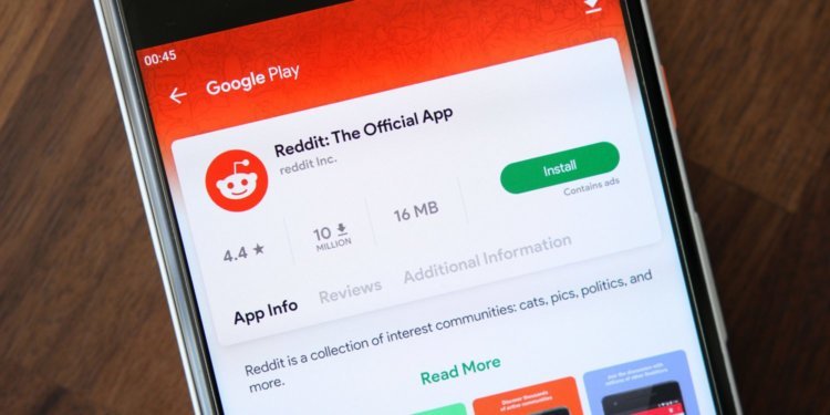
This was not the case, for example, in the case of applications for Windows Phone. I was the owner of HTC Mozart on Windows Phone 7.8 and I clearly remember what applications were there. They were stylistically matched perfectly with the operating system. It didn't feel like you were using a third-party product. The experience was very enjoyable, fluid and seamless. In the case of Android, you open VK – there is one interface, open Telegram – everything is different there, then open some WhatsApp or Reddit, and there is also some kind of mess there. And this is observed, including on iOS – devices.
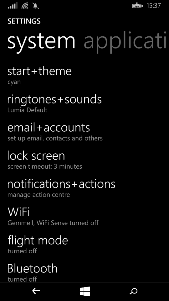
Let's take a look at Windows Phone. This is how the system settings look like:

Settings appearance Windows Phone
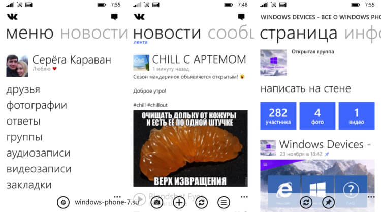
But this was the Vkontakte application for this operating system:

VK app for Windows Phone
Agree, everything was very similar in terms of design.
Interface Android – Applications
It is clear that the manufacturer wants to use its own design, because it seems to him that it would be nice to offer the same user experience both on the web and in the case of phones, but at the same time, no one looks at this situation from the point of view of the smartphone user himself. who wants seamless switching between applications and system functions. Obviously, it is difficult for an ordinary user to get used to the interface of any application every time, and in my opinion, it is necessary to abstract from this, and not from the fact that users will only download your application and use only it – this does not happen.
Even the fact that now we are offered a lot of third-party shells simply spoils everything. People use some kind of OneUI, and the design of the Korean shell is different from the design of some application from Google or VK. This leads to the fact that the system does not feel like something whole. As if it was collected piece by piece. For example, if you go to the digital wellness settings in MIUI, this section will have a clean design Android and quite different from the native design MIUI. By the way, I don't really like MIUI and here's why.
This problem is important and needs to be addressed somehow. And everything would be understandable if Google's guidelines offered a bad look at the interface, but Material Design 2.0 looks good and fresh. I would be glad to see Telegram or VK in this design. It is interesting to know your opinion on this matter. Share it in the comments and read our news in Yandex Zen.
